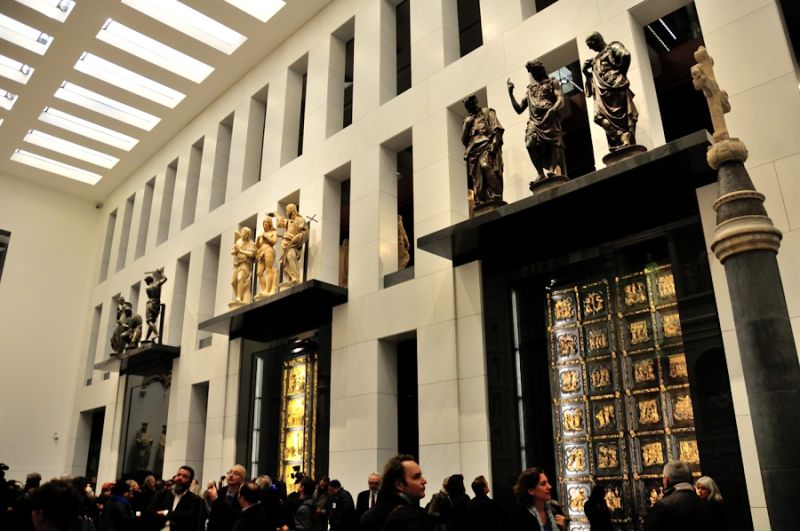
The opening of the Museo del Duomo in 2015. Photo: Andrea Paoletti
The reviews for Florence’s Museo dell’Opera del Duomo highly anticipated reopening in 2015 after an expansion and extensive renovation were enthusiastic. The Florentines were thrilled about finally having a truly 21st century museum in their city center. But when I made my first visit that November, my reaction was very different. I was stunned by the many unaesthetic choices made by its designers, left cold by its grand gestures, and particularly disturbed about how it had intentionally eliminated the possibility of intimate contact with so many of its iconic works – like Donatello’s Magdalene – something that was a hallmark of the old museum. This past summer I returned again, hoping that my initial reaction was simply shock at seeing big changes in an old favorite museum. Yet the second visit only reinforced my disappointment and frustration.
This Fall, however, I had an extraordinary opportunity to understand the philosophy behind the changes to the Museo dell’Opera by joining a tour given to Museum Studies students. The leader of the tour was none other than its Director, Monsignor Timothy Verdon, who, I came to learn, was behind all of the design decisions for the new museum. If anyone could convince me of the wisdom of these changes – this was the man.
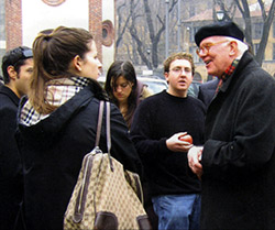
Monsignor Timothy Verdon
Timothy Verdon has had an extraordinary career. While originally from New Jersey, he has lived and worked in Florence for more than half a century. An expert on sacred art, with a PhD in Art History from Yale University, he has curated important exhibits and written many books on the subject. Today, besides being Director of the Museo dell’Opera del Duomo, he teaches at Stanford University’s Florence campus and is the Canon of the Florence Cathedral complex, which includes the Baptistry, Giotto’s Campanile (or Bell Tower), and the Duomo.
Our group met the Director in the lobby, which remains at the old entrance to the Museum. Msgr. Verdon greeted us with a sweet and friendly smile, acknowledging his enthusiastic introduction by a faculty member with endearing modesty. He began the tour by explaining the goals of the renovation. His words revealed the central role he had played in developing its new vision. “My vision” was to re-connect the museum with the historical sites of the Cathedral piazza. He pointed out that the Duomo museum is unlike a typical museum, since almost all of its art is from one place – the buildings of the Piazza del Duomo — the same place where it is shown. Thus, unlike almost any other major world museum, it provides a unique opportunity to talk about the place itself and to have what Verdon called a ‘narrative.’
Yet the museum also faces some special challenges. Located in the midst of one of the world’s most popular cultural sites, it is visited by about 300,000 visitors per year. In an age of global mass tourism, no director can assume that these visitors have an understanding of Christian iconography or even the Judeo-Christian heritage. How can a museum make its story intelligible to visitors from all the world’s cultures and all levels of interest?
Expansion and opportunity
Originally founded in 1891 to house the large statues of the Cathedral complex, as the years passed the old Museo del Duomo museum grew organically “with no logic” as works became available. By 1998, when an old theater next door came up for sale, the collection had long outgrown its exhibition space. Normally in Florence, this would have been an opportunity with many problems. A historic theater usually would be a protected space, requiring careful restoration and condemning the Museum’s architects to years of permit applications for every change. In this case, ‘luckily’ the old theater had been stripped of most of its decoration back in the 19th century and was now being used as a parking garage. By acquiring it, the Opera del Duomo Museum not only doubled its square footage, but gained the possibility of “big spaces” and a complete re-imagining of how to display its collection.
Verdon and his team were facing “a fantastic opportunity.” Each object, its placement, context, accompanying texts, along with the flow of visitors between displays, could now be rethought. Art that had long been in storage could now be shown. Out of the old, a new museum would be born.
The Director’s goal for the new Opera del Duomo Museum was to display its art whenever possible in a way that was “analogous to its original setting.” In other words, if a Renaissance sculpture had been designed to be seen 20 meters above the heads of visitors and in the midst of many others, it would be exhibited, whenever possible, as its maker originally intended.
The tour
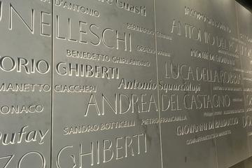 We entered the new museum through what had once been a carriage entrance. This narrow passage was now a “Hall of Fame” whose wall listed seven centuries of artists who had created works for the Opera del Duomo and the buildings of the Cathedral complex. Familiar names like Donatello mixed with lesser known ones like Giovanni del Balduccio.
In the first room, visitors are greeted by a video that explains the history of the original façade of the Cathedral of Santa Maria del Fiore, more commonly known as the Duomo. Because Florence wanted its entrance to surpass the fabulous one of the Cathedral in Siena, in 1296, it commissioned Arnolfo di Cambio, who had previously worked on Siena’s Cathedral, to design both the church and the finest façade in Tuscany. The early 14th century was about to become a great period of building in Florence and all of Tuscany. The model the Florentines had in mind was the ‘modern’ Gothic churches of France, like Notre Dame Cathedral, grand cathedrals whose entrances were decorated with ‘living stones’ depicting Biblical figures.
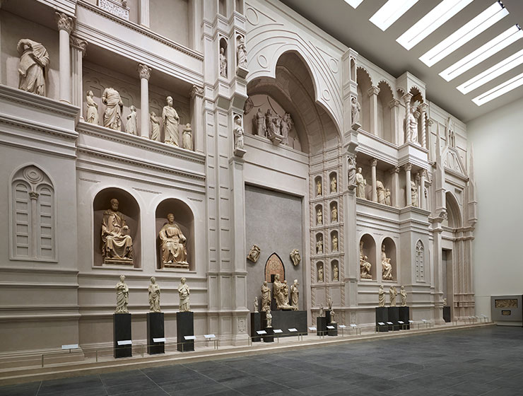
A special feature of the new Museo dell’Opera del Duomo in Florence is its full-scale recreation of Arnolfo di Cambio’s unfinished original façade for the Duomo from the 1300s.
While Florence’s Duomo façade was never completed and ultimately demolished in 1587, for nearly 300 years it was the dominant feature of the religious center of Florence. This was the façade of the Florentine Renaissance, the one that Lorenzo de’Medici and Michelangelo knew. The Duomo’s entrance, even unfinished, was surrounded by the largest collection of monumental sculpture in Italy.This is what Ghiberti had to visually compete with when he designed the famous Baptistry doors. His doors were not meant for a museum but to live in the Piazza del Duomo – “a great urban space unlike anywhere in Europe.”
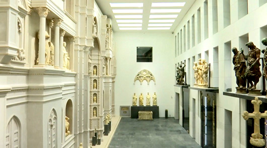 For Monsignor Verdon, the addition of the old theater’s space to the Duomo Museum would be an extraordinary opportunity to restore “a dialog” between the Baptistry doors and the old façade. Thus much of the new space in the Museum is taken up by a three story “colossal model” of the original façade with figures placed at their original heights (some are originals, others copies). Across a mini-piazza are the original Baptistry doors, freshly restored, and encased in gigantic, climate-controlled glass vaults. Called the “Hall of Paradise,” it is the grand moment of the new museum – a spectacular space, filled with light.
Beyond the grand entrance
As they exit the huge, brightly lit space, visitors can see the few remaining fragments of the mosaics that were once over the central door. Archaeology has revealed that the original façade was not simple white marble as portrayed today, but richly decorated with glittery mosaics. According to Verdon, they must have glowed at sunset, a vision of “the heavenly Jerusalem.”
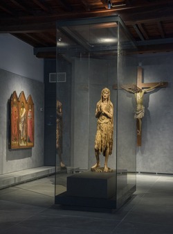
Donatello’s Penitent Magdalene (around 1455). Photo: Antonio Quattrone, Museo dell’Opera del Duomo
From there, visitors enter a series of darker spaces, much like the darkness they’d be plunged into when entering the Cathedral or Baptistry from outdoors. Lit with intimate light, we first encounter Donatello’s Mary Magdalene, a thin, haunted soul, clothed only in hair and fur. Once out in the open for viewing, now this painted and gilded wood carving is inexplicably encased in a long, rectangular glass tomb that keeps viewers four feet away when directly facing her. You can only examine her closely when you pass along her from the side.
The glass case’s peculiar shape, according to Verdon, was designed to maintain the flow of tour groups, to (I assume) discourage them from lingering, and direct them to the next room. There another iconic work of the museum awaits – the Deposition or Florentine Pietà by Michelangelo.
Unlike most of the Museum’s collection, this unfinished Pietà was not made for the Opera del Duomo but carved by Michelangelo in Rome for his own tomb. In the old museum, it was located at the top of a flight of stairs, so visitors would approach it slowly like pilgrims and pass around it in an intimate space with beautiful wood walls. Today, it is isolated from the rest of the museum in an enormous modern space, surrounded by walls of flat, gray stone. Placed at an altar’s height with a minimalistic stone bench in front, Verdon said its placement had two goals. The first was to evoke a “sacred space.” The second was to provide large tour groups with a location to gather and exit the museum quickly.
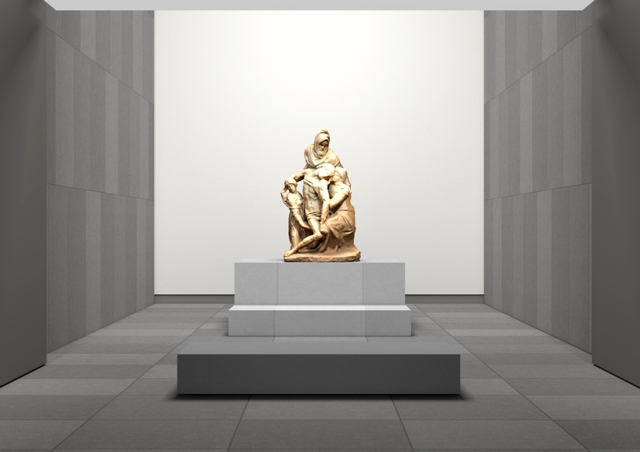
Michelangelo’s Florentine Pietà, 1547 – 1555.
When planning the new museum’s design, he simply could not ignore the fact that Florence today is a city of mass tourism. For most visitors, his museum is just one stop in a one day tour of the city. To accommodate this sad truth, he had to design an interesting and simple path with grand effects that would facilitate movement and the interests of the majority of visitors who visit for only a half hour. So not far from the bench in front of Michelangelo’s Pieta is the gift shop and the exit. What does the Museum offer to those on a short visit who know little about Art History beyond the name Michelangelo — “We offer the spectacle!” Like a real estate ad – “drop dead views.”
The plan of the second floor is for more interested visitors. It has more text on the walls and many of the original sculptures that those who loved the old Museum remember. For example, in The Bell Tower Gallery one can see the 14th century decorations by Pisano and others of the many trades and skilled workers of Florence.
Msgr. Verdon expects only a limited number of visitors with specialized interests to venture up to the third floor. There they will find the many Princely gifts from the Florentine rulers. Most impressive are the collection of large wooden models – proposed designs for a new façade for the Duomo from three centuries of competitions that did not conclude until the late 1800s with the façade we know today. Truly dedicated art lovers are finally rewarded with something that any tourist would wish for — an uncrowded outdoor patio that provides an extraordinarily close view of Brunelleschi’s dome (and nearly empty restrooms).
The overall impact of the new museum’s design
So now that I know the factors that drove Timothy Verdon’s plan for a new Museo dell’Opera del Duomo and understand the pressures he faced, do I appreciate his museum more? I suppose I do, but I still mourn the losses that resulted from bowing to the realities of global tourism.
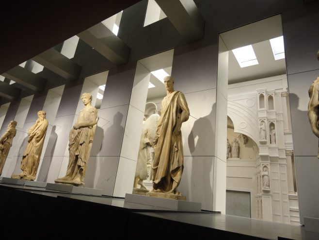
Donatello’s Zuccone and other decorations.
The new Museum certainly handles crowds better and offers some truly wow moments. But, overall, it remains a colder experience compared to the old museum. I have always loved the intimate encounters with extraordinary art that only museums can provide. To have to strain my neck to study Donatello’s Zuccone at its original height, distracted by cut-out spaces around the statue that open down to the spectacular new façade below, with its crowd noises, is a painful loss. To have to peer in a dark room through thick glass across a flat podium to see his Magdalene, when once she was out in the open and at arms length – these are losses that are not compensated for having ample room to back up or quieter spaces upstairs.
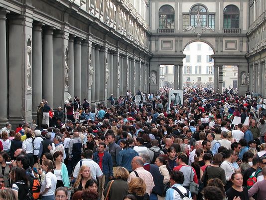 The Museum’s organization makes it depressing clear that, even in Florence, dedicated art lovers are a minority. It acknowledges that we live in a materialistic world, where governments keep cutting their budgets that support the arts, forcing museums to depend on tourism for funding and their survival. As in the Renaissance, it is a world that serves the wealthy (who never have lacked for intimate encounters with art if they so desired since they can buy it).
But weren’t Museums the one place that we could go to get beyond that? A place where anyone could see art like a prince and dwell in a higher realm?
So, I wish the new Museo dell’Opera del Duomo well. Yet, I can’t help worrying about those of us who love art. If more Museums follow its example, as understandable as that may be, where will we go?
