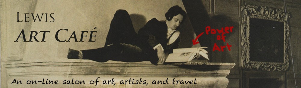
The Clark Institute’s new museum wing and reflecting pool.
Photo: Tucker Blair
On July 4th, the long awaited $145 million addition and renovation of the Clark Art Institute opened. A beloved museum in the Berkshires, the Clark has been for decades everyone’s secret discovery. Planning began in 2001 and all signs (including a recent review in the New York Times) pointed to an extraordinary success.
Sadly, it is far from that. Like the Brooklyn Museum’s new entrance unveiled in 2004, the addition is an unfriendly imposition that ignores the spirit of the original architecture and is at odds with the collection it houses. Designed by Tadao Ando, the extension and landscaping dishonors its founders with an anonymous space that could be any museum in the world, not one of the crown jewels of New England. It seems far too meaningful that the Styrofoam backed panels on “The Clark Story” and the portraits of the founders, are now relegated to the basement (sorry, Lower Lobby) — with the rest rooms.
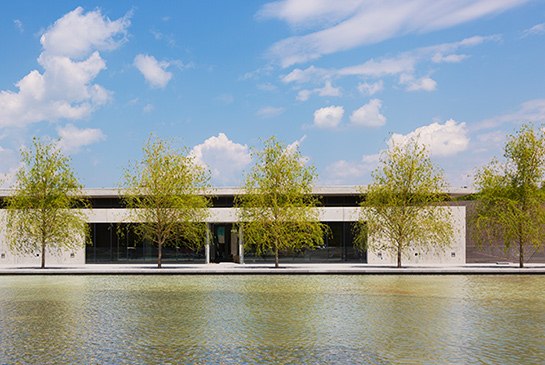
Detail of the Clark Art Institute’s concrete and red granite exteriors.
Photo: Kris Qua
Celebrated Japanese architect Ando has served up the typical contemporary minimalist monolith. Again and again in recent years, we have sadly witnessed wealthy board members and donors engaging in some kind of glitterati arms race in an effort to make their marks on a great institution. Similar damage has been seen more than once at the Museum of Modern Art. Recent reports suggest that another beloved icon, New York’s Frick Collection, will be next to succumb to this brutality.
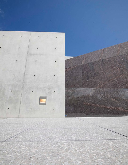
Lower level staircase.
Photo: Tom Brenner.
The Clark’s new entrance is hidden behind the building and not visible from the street. On arrival, one isn’t quite sure how or where to proceed. There is an orientation center, but during our visit a young guide blocked entry and directed visitors towards the museum’s new entrance. Reminiscent of the National Gallery’s East Wing, Admissions is found in a desk among soaring cement walls and glass. To the left is an exhibit gallery, currently showing Chinese bronzes that seem completely at home in this modernist setting. To the right — a gift shop. Instead of exiting through the gift shop, one now enters through it (though later we discovered you had to exit through it, too).
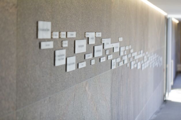
Wall of Donors
Photo: Tom Brenner
After passing through the gift shop, traffic proceeds along a severe and relatively narrow minimalist passageway flooded with light. On its flat cement walls, you can read the names of the donors responsible for the addition and renovation, each printed in a nondescript font within a pale rectangle. The size of the box apparently relates to the size of their gift. This pathway opens into a large, nearly empty, glass-walled vestibule. Across from you are tall tinted glass doors, which finally lead you into the original museum building.
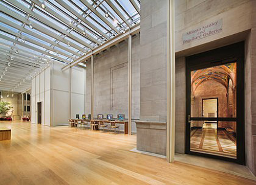
Museum Building, Clark Art Institute, Williamstown, Massachusetts
Photo © James Ewing
Because these, like all the doors, are too heavy for most patrons, a guard hauls them open. One is immediately plunged into a jarringly dark, small space. The gallery is devoted to some of the Clark’s greatest and most loved artists — Winslow Homer, George Inness, and Frederick Remington. Unfortunately, the opening and closing of the glass doors by obliging guards sends shock waves of glare onto Homer’s centrally placed Maine landscapes. Viewing is disrupted over and over again by the glare and darkness, darkness followed by glare, as new visitors enter.
Because one has just left the wide open spaces of the new construction, the space seems claustrophobic. So instead of lingering to admire Homer’s great paintings, one feels compelled to leave the room as quickly as possible, especially since new viewers keep arriving behind one’s back. The overall impression left by the first gallery is like entering a stately home through a side door.
Regrettably, the previous free and flowing movement of visitors around the Clark Institute has been completely, and one assumes deliberately, destroyed. In the past, one approached the main galleries up a wide staircase and through a short hallway into a rectangular corridor where you could easily move either left or right. This corridor, which circumnavigated the entire space, opened into smaller galleries with windows to the outside or onto central galleries lit by skylights. The space was rational and the layout made for a very personal viewing experience based on one’s tastes. One could decide to enter one of the many outer rooms, or simply walk the corridor (also lined with wonderful artwork) to discover one of the larger, central galleries that housed the collection’s major Impressionist and more traditional 19th century paintings. The visitor tended to come to these dramatic central rooms, the heart of the collection, after exploring other galleries in a gradual visual build-up to a peak aesthetic experience.
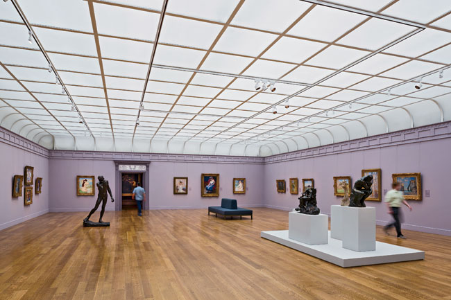
The new Impressionist Gallery
Photo © James Ewing
Now, the curators have placed the museum’s most popular holdings in the first three rooms (in a bow to the impatient?): the Americans, followed by the Impressionists, then the 19th century masters like John Singer Sargent and William Bouguereau. The familiar central Impressionist gallery has freshly painted pale lilac walls. Unfortunately, it is lit so brightly that the pictures appear washed out and the open floor space in the room seems strangely empty. In the next gallery of Academic paintings, the darkness returns again with deep purple walls and pedestals (intense, striking colors being the current rage among museum curators who can’t seem to leave well enough alone).
After exploring these three major galleries, however, the viewer at the new Clark is forced into a controlled, maze-like rabbit warren from which there is no escape other than moving forward or backward. There are some new pleasures, to be sure. There is now a small room with three wonderful pictures by Rubens in what resembles a hall closet. But the once lovely flow of the collection has been destroyed by a rigid, didactic pathway with small (intimate?) spaces, some in dark colors, and occasional unexpected dead-ends.
Once one completes the tour of the now twenty galleries there is no other way to exit than to return via the first three rooms in the center. You are forced once again to walk the narrow plank with donor names that leads to the new entry and the gift shop. The space itself is reminiscent of Berlin’s Holocaust Museum.
Many staff members have been added to handle the very heavy doors and the justifiably confused patrons. Throughout the museum, there are numerous helpful young people in light green shirts to direct the visitors trying to navigate the now ‘re-conceptualized’ Clark Institute. We asked if there has been ‘some confusion.’ The answer was, “yes, some…(gulp)…Actually a lot.” One young staff member thought it best to describe the new Clark as ‘a work in progress.’ And, to be fair, there are some unfinished parts like the red granite Manton Research Center that have yet to reopen.
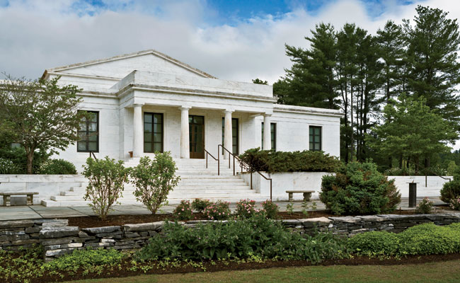
Morgan Library and Museum, New York City
Renovation by Renzo Piano
It is possible to expand and enhance a historic building with contemporary architecture that respects the original. The Morgan Library in New York City has done this very well. But the Clark Institute is not that. The crown jewel of the Berkshires is now dressed in a monument to its Board of Directors that art by Jeff Koons would feel at home in. Over and over again, we overheard visitors saying “We are so confused” and “Where are we”?
Ando’s design for the Clark Institute has been praised in many articles for its innovative use of flat, rectangular ponds and water managment systems to improve conservation. The landscape architect who worked with Ando, Gary Hilderbrand, explains in one article how they successfully connected three very different buildings underground. He is also thrilled about the improved loading dock — “This building has provided one of the great loading docks of all time.” As essential as these may be to the internal functioning of a museum or the goals of creating an eco-friendly institution, in the end a successful renovation will be measured by its impact on those who view the art. One wonders about an art critic like Roberta Smith of the Times who applauds the renovation of the “rather fusty Sterling and Clark Art Institute” as one that “has gotten bigger and better” and describes the museum as a “sharp reprimand” to a “noxious” museum trend — “pandering to the public.”
At our visit’s end, we did discover with some relief that the lovely water lily pond reminiscent of a Monet has survived the renovation of the grounds. Sadly, the greenery around it has been cleared and only a few tall trees are left to attempt to provide a bit of shade. It is now surrounded by a grassy field. The pond seems shrunk and is drowned in the glare, much like the Monets and Renoirs inside.
Pingback: Triumph and Travesty in Florence: Baptistry cleaned and Museum reopens | Lewis Art Café