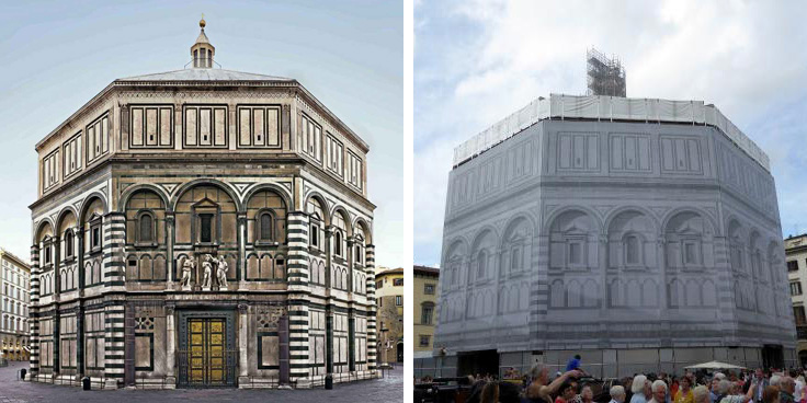
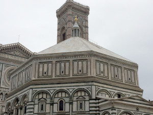
This fall, there is good news and bad news from Florence. Lovers of the city rejoiced during the last week of October when, just before the visit of Pope Francis, the scaffolding and giant canvas tarps around the Baptistry finally came down. Since February 2014, the nearly thousand year old Florence Baptistry has been wrapped and blocked from view while its walls were given their first top to bottom cleaning in seventy years. Like a giant gift box finally opened, all can finally see what has been missing from the heart of the city for almost two years.
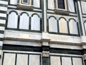
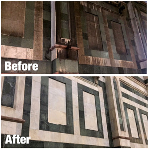
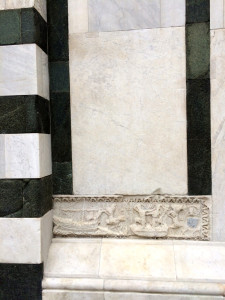
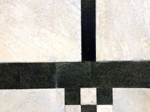
The $2 million restoration was a huge undertaking not just because of the size of the building or its age, but also due to the variety of marble found on the Baptistry’s exterior. According to the Opera di Santa Maria del Fiore, which manages all the historic buildings in the piazza, its cladding ranges “…from Apuan [Carrara] marble to the oldest marble recycled from ancient Roman buildings and tombs.” Most difficult to handle of all is the green serpentine of Prato, a very fragile stone. Depending on the material, conservators used chemical softeners, sponges, scalpels and lasers along the eight sided building.
Yet I am happy to report from a visit earlier this month that the results are simply spectacular. The white marble looks bright and fresh. It contrasts beautifully with the black and green marble, which now appear deep and resonant. The Baptistry’s designs seem crisper and more abstract than before – almost modern. In comparison, the nearby 19th century facade of the Duomo’s entrance, cleaned not so long ago, seems not just overly complicated, but also tired and grimy.
Perhaps most shocking is the change in the Baptistry’s roof. In the past, it had a gray metallic color with what looked like some random splashes of whitewash. Now, one can see that it is not made of lead at all but stark white marble.
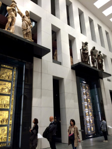
The success of the restoration is good news to art and architecture lovers. Unfortunately, the news is not so good concerning the long awaited expansion and reopening of the Museo dell’Opera di Santa Maria del Fiore. The two and a half year renovation tripled the exhibition space of the museum and allowed for a complete reconsideration of its exhibits. It now has a great hall, the largest exhibition space in Florence, which features a life-size reconstruction of the original Medieval façade of the Duomo and the newly cleaned Baptistry doors by Lorenzo Ghiberti, “the Gates of Paradise”.
No expense appears to be have been spared in the new Museum (now part of the “Grande Museo del Duomo”). The giant façade in the Great Hall or “Hall of Paradise” alone cost nearly $2 million to construct. However, the flood of money seems to have washed away much of the once beloved museum. The architects, Adolfo Natalini and Guicciardini & Magni, have followed a vision that is less Florentine and more reminiscent of the faceless corporate skyscrapers of Manhattan or the mall-like new Yankee Stadium.
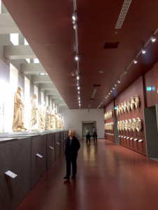
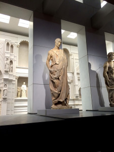
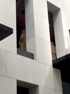 Not unlike other museums that have succumbed to the tastes of donors and directors who insist on leaving their mark on great institutions, taste and the visitor’s experience lose out to the cold, flat symbols of wealth and the most sterile of modern architecture. The great sculptures of Donatello, like his famous Zuccone, and the relief sculptures of the various crafts and guilds by Andrea Pisano that were designed for the Bell Tower now line a long ‘Hall of Sculptures.’
It is difficult to focus on any of them as they are now lost in an overwhelming space and placed over your head. In addition, the wall behind the Donatellos has openings cut into it so that you can see (or be distracted by) the brightly lit replica of the old Duomo façade a floor below you.
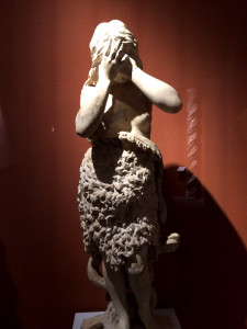
Elsewhere, Donatello’s dramatic and heart-breaking Mary Magdalene is still at eye-level, but is now encased in an enormous glass tomb. Inside, she stands at the back of a long podium for no apparent reason except to prevent you from getting near her and gaining a good look. Seeing art is a battle in too many places in the Museum. Many of the artworks are now behind thick glass walls, which have strangely placed seams (sometimes directly in front of a sculpture) that you have to look around. You find yourself fighting the glare on the glass because of the poor placement of lighting.
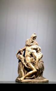
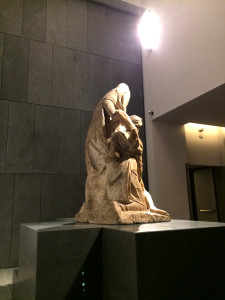
One of the treasures of the Museo del Duomo, Michelangelo’ Deposition, also known as the Florentine Pietà, is not behind glass but the viewing experience is not much better. In the old museum, it was placed on a landing at the top of a flight of stairs. One walked up to it like a pilgrim and could circle and study it in a small, intimate space. Today it is isolated in a huge, overpowering room with a two-story blank wall behind it.
Stunned by the unaesthetic choices made over and over again by the Director and his curatorial team, I began to wonder if I was simply overreacting to the loss of familiarity in what was once one of my favorite museums. Towards the end of my visit, I decided to ask the opinion of the new museum from a couple of people who knew both the old and new museum better than almost anyone — the guards. While clearly uncomfortable with my questions (“I’m sorry it is not my place to say this…”), I could see immediately from the look on their faces how they felt about the new design. One guard sighed and pointed out how the thirteenth century Madonna with the blue glass eyes, so striking in the past, was now invisible, lost in the huge façade in the Great Hall. Another put it succinctly, “it’s cold…too Hollywood.”
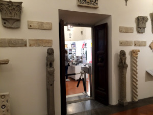
Overcome with sadness after waiting so long for this reopening, I searched for a familiar location from the past, so I could feel at home again. Towards the end of the visit, I found one — the room filled with small sculptural odds and ends from the Duomo was hardly changed. Once it was near the beginning of the tour, at the bottom of the staircase that led up to Michelangelo’s Deposition. My comfort and pleasure did not last long, however. The architects chose this room to announce the end of the visit in the manner of all modern museums. Rudely cut into one wall is a doorway with a turnstyle – the entrance to the bright, new gift shop.

Having been in and out of Florence for 20 years and a resident for 8, I can say that the Battistero is marvelous and breathtaking now after its superb cleaning and restoration. You have rightly praised its resurrection.
However, I disagree with your take on the new Grande Museo del Opera Duomo. It is a marvelously “luminoso”, simple and airy showcase for these artworks. I know many Florentines that love the design and the space through which one can move and actually see each piece of art.
As impossible as it is to pick out statues on the existing Duomo, cramming these originals into a small, dark, museum would be a travesty.
I thoroughly enjoyed being able to walk up to each Saint and figure in this spacious, well-lit museum and study it to my heart’s content without anyone else standing directly behind me trying to see at the same time.
The museum is amazing. You do it and the architects Natalini and Guicciardini & Magni a great disservice in this article.
Pingback: A Director’s tour of Florence’s new Duomo Museum | Lewis Art Café